There’s a theory of Japanese car construction called poka yoke. It was described to me as meaning a form of idiot-proofing but it really means “mistake proofing”. Pieces of the car are manufactured in such a way that they can only be used on one particular part of the car.
Everything that we create when producing websites should exist on this level of poka yoke design. The goal in user interface design is to remove all ambiguity so that each part of the website can only be used in one particular way.
This is a lot more difficult than it seems. Take, for example, the simple hyperlink. So often, when analysing an existing website I see the words “click here” either preceding or following an instruction.
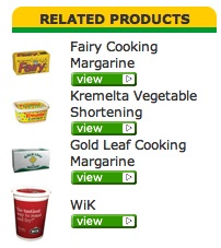 In the case of the Peerless Foods website, which I was shown on the weekend, there’s simply the word “view” near some text. (See the image to the left.)
To some it might seem like “click here” or “view” is the perfect example of poka yoke. It’s a link and we’re supposed to click on it and that’s what it says. But the design* has failed.
Creating a website design requires making as few assumptions about the user as possible. One of those assumptions might be that the user knows how to use a mouse. That might seem like a reasonable assumption but what about people who use other interactive devices? What about just keyboard or suck and blow straws or touch screens.
So the minimal assumption has to be that the user realises that there is an interactive device that they can manipulate in a way that will be reflected on the feedback device (screen or screen reader etc., from now on just referred to as “screen”).
So the user moves the cursor around the screen. It’s the feedback that we provide as designers that tells the user to activate that link. Sometimes that’s as simple as a different colour text with an underline. Sometimes that’s a hover state that alters the size of an element. Maybe the cursor changes from an arrow to a hand. Maybe it’s just as simple as making sure that the right html tags were used.
There’s a usability adage that if there needs to be a sign on the door that says “push”, the designer of the door has failed. That fact that the door needs to be pushed to open should be implicit in its design.
It’s tempting to put a “click here” at the end of a sentence because it’s the easiest thing for the content creator to do but it complicates issues for the user of the website. It’s clumsy and it reflects poorly on everybody involved in creating the website.
Most importantly, it’s not mistake proof. On the Peerless Foods website, those little green buttons don’t give the user any extra information. In fact, it’s not clear that they are even related to the information above them.
A bit of text that says “if you want to contact us, click here” is nowhere near as succinct and obvious as one that just says “contact us“.
For more reading on website usability, we recommend the writings of Jakob Neilson, and Steve Krug’s book, Don’t Make Me Think!. There’s also a great book about the usability and design of doors and kettles by Donald A. Norman.
*when I talk about design I include content because it’s an important part of how people interact with a site. I also include the choice of HTML tags.
3 Comments
A bit of text that says ‘contact us’ is succinct, but it’s only obvious if the user can see that clicking on it will do something. I think most people understand that coloured and underlined is a link, but they can get confused if links are presented in another way, or if there is coloured and underlined text that is not clickable.
Buttons are a bit harder, because some look clickable and some don’t. For example, the presentation and the position of the ‘POST A COMMENT’ text makes me suspect it’s clickable, but I’m only sure when I mouse over it and it changes colour.
November 16, 2010 at 8:34 pm
You make a good point Mary, we’ll change the text of ‘post your comment’ to something more descriptive and direct.
November 17, 2010 at 11:50 am
Where I work one of the digital fellas sent all us writer fellas these two links a couple weeks ago about this stuff.
http://www.smashingmagazine.com/2009/10/13/call-to-action-buttons-examples-and-best-practices/
http://www.wilsonweb.com/conversion/follansbee-call-to-action.htm
November 17, 2010 at 12:22 pm