The details are important.
Recently I saw a TED Talk (embedded after the jump) by Rory Sutherland, Vice Chairman for the Ogilvy Group in the UK. In it he describes how it’s the small things that really make all the difference. These small things are the details.

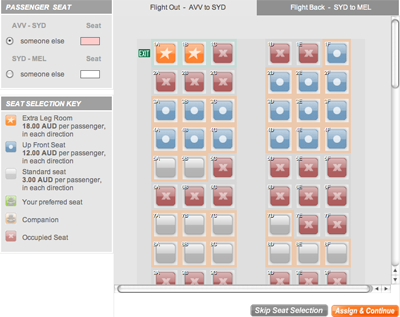
A friend just booked a ticket on Jetstar while I watched (these are the things I do on my holidays). Jetstar’s ticketing system is pretty simple and straight-forward until you get to the seat choice page.
This is where confusion occurred. She clicked around for a bit but, very simply, just did not know what to do. The page confused her.
If you’re also confused, the squares with the stars, circles and crosses are seats. Some of those are seats that are already reserved (red with crosses), some cost extra because of their premium positions (up front or extra leg room). The squares with light grey and dark grey inside them are available.
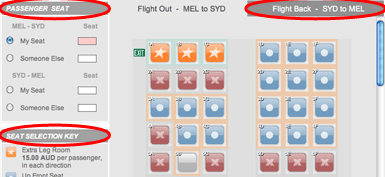
Mostly the problems related to the tabs at the top of the seat chooser. See that the “Flight Back” tab is a dark grey and so are the headings on the sidebar areas on the left? This is a confusion of the visual grammar of the site (highlighted in the next image).

In this context, a dark grey background means “heading”. It’s possible to make this even more specific and uniform and say that a dark grey heading background with capitalised, italicised and white text means “heading”.
Because of this initial confusion, something else I hadn’t expected happened. The visual grammar prompted her to imagine a separation line extending down from the edge of the tabs. The way she initially read the page, the left half of the little boxes were for seats on the flight out and the right-hand-side were for seats on the way home. Because three little boxes did not correlate with her knowledge of aeroplane seating, she was at a complete loss of what to do.
The tasks she expected to be able to perform on this page and the information she received from the page were at odds with each other and a kind of user paralysis settled on her mouse hand. I’ve seen this user paralysis before. The user eventually gets over it and figures out what the page is asking of them or they give up and shop elsewhere. Either way, they think less of the website and the company as a result of their negative experience.
The very same thing happened to me when using the Myki website for the first time to purchase my card. I only persevered out of professional interest for how to make a poor user experience. If I was anybody else I would just continue to buy my public transport tickets at the local milk bar.
A lack of attention to detail causes user paralysis. Very few website producers manage to create a website without something that could lead to this, but it happens most often in forms. It’s one of the reasons that user testing is so important. It’s also a good reason to have some budget up your sleeve to make a whole bunch of tiny changes about 6 months after the website launches.
When we’re building websites we try to preempt what a user will experience. If we skip steps in designing these experiences, or rush, or miscommunicate some ideas, we are in danger of spoiling the user’s opinion of the company, our client.
We ask a lot of questions of our clients because the way their customers use their websites will be a vital part of their business. Sometimes this means finding out a lot about how the business works. Sometimes it means asking questions that the client thinks irrelevant or has never really thought about before. It’s hard work for all involved but it’s exactly through this process that we get to identify a lot of the details we need to include in the website.
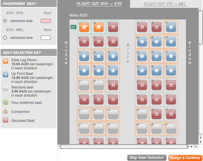
Some tiny details are all that the Jetstar seat checker required to make it more obvious on how to proceed:
- Make the active tab consistent with the heading styles;
- Create some lines of demarkation between the tabs to make their seperation more obvious;
- Identify the windows and aisles of the aeroplane;
- Declare the type of aeroplane to give a better idea of what the user is looking at.
I’ve created my own version of this in the image below. I am, by no means, a graphic designer, so please excuse the sloppy work. The point, however, is that it wouldn’t take very much work to fix this, but it’s also really easy to see how something this small could be missed the first time around.

My friend would have worked out the page within about 30 seconds but she shouldn’t have had to work at all. All the work should have been done for her beforehand. Our job is to make website interaction as obvious as possible. Doing that takes a lot of attention to detail.
And now, enjoy learning a little bit more about details from Rory Sutherland:

